We've started our
Amazon Fresh trial subscription. Being Amazon addicts who even prefer Amazon Prime video to Netflix, it was a foregone conclusion. It's surprising and embarrassing we took more than a day to consider it.
We received our first delivery of two tote bags full of groceries on Sunday.
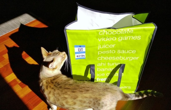
I'll start with something esoteric.
Fresh weaponry
Ever find yourself perusing the
Swords and Daggers aisle of your local Ralphs, Vons, or Bristol Farms and wish you could just have your weekly supply of
throwing knives, milk, and breakfast cereal delivered same-day to your door? Amazon Fresh has you covered.
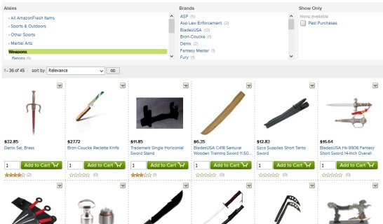
I haven't yet added one of these to my cart, but I've shared this screen capture enough times for the NSA to contact the local authorities. I believe Amazon Fresh also sells tin foil, which is enjoying a well-deserved uptick in its reputation.
Product catalog
The most important question with Amazon Fresh is
do they sell the stuff I want? The short answer: probably, in one manner or another, but there is room for improvement. Let's start with the quality of the catalog data itself.
Data problems
Like Amazon proper, Amazon Fresh suffers from catalog data problems, most notable being
inconsistency. If you are looking for
yogurt you'll probably want to search for
"yogurt." Then you'll realize you've got a bunch of non-yogurt things made with yogurt included in your search results. So you'll use the "Aisle" navigation tool to narrow in on the prize...
... and see
168 items matched:
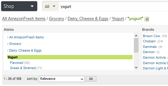
But if you've used Amazon much, you know to
remove your search term as soon as you find the appropriate taxonomy. You do this because despite having gobs of money and thousands of man-years of know-how in running e-commerce stores, Amazon still can't classify products consistently.
Removing the search term yields
182 items:
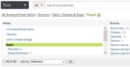
Observant readers will notice that one of the Chobani yogurt products is classified as
yogurt but isn't, you know, "yogurt." This... is... Amazon!
The product catalog itself
Assuming you take the time to properly expose the full breadth of the product catalog to find what you're looking for,
do they sell the stuff you want? For the most part, yes.
Since
Fresh & Easy opened their location on Rosecrans, I've been an F&E shopper. So I have already dealt with adapting to a reduced selection compared to mainstream grocers.
Roughly, I would say both Fresh & Easy and Amazon Fresh offer somewhere between
a third to half of the options of Ralphs or Vons.
Obviously, they don't just cut out entire categories of product. Rather, they just trim your options within each category, some more than others.
The eccentric LA Spotlight items
Obviously a highlight of Amazon Fresh is that it's more than a grocer. They will deliver many products from the
massive main Amazon catalog. They have also partnered to deliver a variety products from high-end Los Angeles restaurants, pastry cooks, and other purveyors (this word willfully selected for its modern hipster connotation) of
expensive luxury treats.
I admit, like most, the LA Spotlight was the first section I browsed.
Oooh, what sort of unique taste delights can I have delivered to my door? Mochi! Tea! Fresh meat! Cakes! Cookies! Sausage sandwiches! Bread! Bittersweet chocolate! Ghost peppers! Artisan olive oil! Click click click.
I must see all of these goodies.Fancy a six-pack of $3 donuts made without a trace of that boogeyman named
gluten? Amazon Fresh has you covered, optionally with a ninja blade to boot.
Allow me to summarize the LA Spotlight section:
- Organic
- Expensive
- Gluten-free
- West LA
- Costly
- Vegan
- In-your-face branded, artisan
- Bittersweet (chocolate lovers will know)
- Not cheap
Not exactly my cup of American Tea Room Bao Zhong Royale Oolong Tea.
Amazon probably knows Los Angeles early adopters better than I do, though. I'll bet they've moved a bunch of these products already.
Also, I admit that if they would cart
SusieCakes the two miles from the store to my house, I would succumb to the temptation and eat far too many $3 cupcakes. But something tells me SusieCakes are made with plain gluten-full genetically-modified egg-laden recipes. Not a good fit for an LA Spotlight.
Mediocre user interface
I'd like to see the user interface improved considerably.
First, the product photos are too small and unclear.
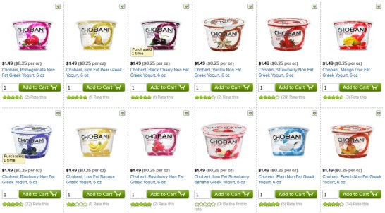
To better compete with the experience of shopping the aisles of a bricks & mortar grocery stores, the product grid should be resized. Each card should be made
square, and larger.
The photo should full-bleed its square and aside from a brief description, the user interface controls should only be visible on hover.
There is way too much noise in the existing product grid with quantity controls, price, star ratings, and add to cart buttons.
Product names
Here is a sample of some of the product names from the screen capture above.
- Chobani, Pomegranate Non Fat Greek Yogurt, 6 oz
- Chobani, Low Fat Strawberry Banana Greek Yogurt, 6 oz
- Chobani, Non Fat Pear Greek Yogurt, 6 oz
- Chobani, Black Cherry Non Fat Greek Yogurt, 6 oz
- Chobani, Low Fat Banana Greek Yogurt, 6 oz
- Chobani, Peach Non Fat Greek Yogurt, 6 oz
Quick! Which of the above 1 through 6 is the pear yogurt?
I'll give you a moment, because the flavor isn't always in the same place. Someone should hook these guys up with an Amazon Mechanical Turk account to
clean up the product names.
I'd consider grouping by brand so that it's not necessary to repeat the word "Chobani" in each product's title. Maybe even group by type of container:
Chobani >
6oz individual serving >
Non-fat >
Pear,
Strawberry,
Black Cherry, etc.
I'm not saying make these browseable categories (heaven forbid, Amazon Fresh already has category overload). I'm just suggesting the grid page's default view may group like-products for quick browsing. Removing all of the redundant elements would allow a larger photo and larger, bold flavor name:
PEAR.
Paging without configurable page sizes
Given the performance problems with Amazon Fresh (see below), it's disappointing that the user interface uses conventional paging for its product browser. Oddly enough, a URL parameter
resultsPerPage is exposed for tinkering. The default is 32, but I just cranked it to 128 and the page loads just fine.
Click away from the page and return, though, and it's back to 32. A site like this should either provide a page size preference or infinite-scroll (where more products are loaded as you scroll down).
Past purchases
Given the weakness of the user interface, the
Past Purchases filter will be a life-saver. You can filter any browse page to show only items you've purchased in the past. If you're like me and you generally buy the same things repeatedly, this will make you forget most of the up-front sweat you poured into browsing for products the first time.
Mediocre site performance
I am interested in
the performance of web applications. In terms of speed, my subjective rating for the Amazon Fresh web site is somewhere between
bad and
mediocre. It's quicker than your average Rails site but slower than can be reasonably expected of a web titan with an effectively limitless legion of servers.
Behold!

That's
1.61 seconds to fetch my past purchases list, which is 9 total items, not counting assets and subsequent AJAX requests. The user experience is actually closer to 4 to 5 seconds.
The combination of user interface clunkiness with seconds lost with each click makes for a frustrating grocery-shopping experience. At least it's frustrating versus the make-believe superior online grocery store in my head. Compared to dealing with Ralphs' crap parking lot and their cantankerous employees, yeah, it's not really that frustrating.
Keep perspective handy when evaluating Amazon Fresh!
Our first Fresh experience
For our first Fresh shopping experience, Michelle assembled a list of 13 items. We were able to satisfactorily select 9 of those for purchase. The most notable failures:
- Dental floss, which is of course available. But our preferred Reach variant was not. Oddly, searching for "dental floss" gives you two Aisles in the navigation control: Pet Products and Electronics. The actual dental floss is in neither, thank goodness.
- Liquid egg whites. Eh, I guess that's forgivable.
- Plain squeezable Blistex lip balm. You can buy this, but only in a $28.32 pack of 12. Hoarder much?
As for upsides, KIND bars are cheaper than anywhere else. Overall, the products offered are
name-brands that we're familiar and happy with. The yams and bananas we included in our order were
high-quality.
The experience of assembling the shopping cart of 9 items took about 30 minutes. We were browsing around and not laser-focused on the items at hand. On the other hand, had I not been happy to be shopping for groceries from my desk chair, the UI clunkiness and slowness would have taken a toll on my sanity.
The delivery
We were uncertain about our Sunday schedule, so we selected a 3pm-6pm unattended delivery window. It turns out I was home at 5pm when the bright green delivery vehicle came to a stop at our curb. Two very large Amazon Fresh tote bags were promptly arranged
right on our door-step as promised. I was surprised that the delivery person didn't knock or ring the doorbell, but it was an
unattended delivery, so that is not a criticism.
You might have heard the rumors and they are true: chilled perishables are kept cold by a layer of
frozen Dasani water bottles in an easy-teardown Styrofoam cooler. We're not really ones for bottled water, but they were free, so I'm happy.
Overall
As I said at the start, we're suckers for Amazon. We'll probably stick with Fresh after our free trial expires and the $220 upgrade over Prime kicks in
for reals. I am optimistic it will get better in time.
And some day I'll order those $3 donuts to see what I have been missing. Mmmm... purple.
 I'll start with something esoteric.
 I haven't yet added one of these to my cart, but I've shared this screen capture enough times for the NSA to contact the local authorities. I believe Amazon Fresh also sells tin foil, which is enjoying a well-deserved uptick in its reputation.
 But if you've used Amazon much, you know to remove your search term as soon as you find the appropriate taxonomy. You do this because despite having gobs of money and thousands of man-years of know-how in running e-commerce stores, Amazon still can't classify products consistently.Removing the search term yields 182 items:
 Observant readers will notice that one of the Chobani yogurt products is classified as yogurt but isn't, you know, "yogurt." This... is... Amazon!
 To better compete with the experience of shopping the aisles of a bricks & mortar grocery stores, the product grid should be resized. Each card should be made square, and larger. The photo should full-bleed its square and aside from a brief description, the user interface controls should only be visible on hover.There is way too much noise in the existing product grid with quantity controls, price, star ratings, and add to cart buttons.
 That's 1.61 seconds to fetch my past purchases list, which is 9 total items, not counting assets and subsequent AJAX requests. The user experience is actually closer to 4 to 5 seconds.The combination of user interface clunkiness with seconds lost with each click makes for a frustrating grocery-shopping experience. At least it's frustrating versus the make-believe superior online grocery store in my head. Compared to dealing with Ralphs' crap parking lot and their cantankerous employees, yeah, it's not really that frustrating.Keep perspective handy when evaluating Amazon Fresh!