It's now considered passé to use just a plain old 16 x 16 image for a site
favorite icon or "favicon." All the cool people are using much larger images so that visitors can enjoy high-resolution icons when they pin your site to their device's home page or application launcher.
How humiliating that Tiamat only had a 16-pixel icon!
Not that anyone ever has or ever will pin Tiamat to their home page, but one can hope, right?
What to do?
I went about researching how many images I had to make. The answer is
more than I wanted to.
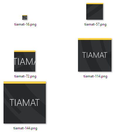
- The old-fashioned and hopelessly uncool 16 x 16 icon. Check, uncool achieved!
- A 57 x 57 version for Apple products. Yes, fifty seven. It's a power of... uh. Give me a moment. Oh, I've got nothing. Just accept it.
- A 72 x 72 version also for Apple products.
- A 114 x 114 version for... Apple products.
- A 144 x 144 version for Windows 8 and Apple products.
As far as I can tell, Apple and Google products use the same resolutions. And if you're okay with the devices down-sampling from the 144-pixel version, you can make just that version. At least that's what the
Apple documentation says.
Icons
I'm no graphic designer, so I just took screen-shots of the background (that
many people hate) and put some text on top. Behold:

Markup
Many devices will intuit the filename of icons, but being pedantic, I decided to be explicit in my markup. Here's that noise:
<meta name="msapplication-TileColor" content="#303234"/>
<meta name="msapplication-TileImage" content="static/logoicons/tiamat-144.png"/>
<link rel="shortcut icon" href="static/logoicons/tiamat-16.png" type="image/png">
<link rel="apple-touch-icon" href="static/logoicons/tiamat-57.png">
<link rel="apple-touch-icon" sizes="72x72"
href="static/logoicons/tiamat-72.png">
<link rel="apple-touch-icon" sizes="144x144"
href="static/logoicons/tiamat-144.png">
<link rel="apple-touch-icon" sizes="114x114"
href="static/logoicons/tiamat-114.png">
It fills me with joy to add hundreds of bytes of nearly-worthless payload to each page response. That assumes the whole response isn't worthless, of course. Oooh, sick self burn!
The first two lines are for Windows 8, as betrayed by the "ms" prefix in their meta tag names. The third line is the traditional 16-pixel image used in legacy browsers. And the last several lines are for Apple and Google things.
Result
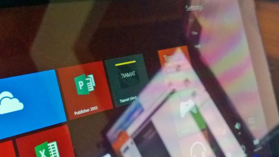
Here is Tiamat pinned to my Surface's start menu. Now I can read my own rants with alarming ease.

I should have put a cartoon cloud in the icon. That would have made it cool.
 I should have put a cartoon cloud in the icon. That would have made it cool.