Too easily applied without sufficient restraint, many popular software development practices devolve into anti-practices, becoming anathema to quality, productivity, and user satisfaction. Here are a few examples.

Mobile-first
Smart phones running iOS and Android long ago eclipsed the market of desktops and laptops computers. Many development teams therefore favor "mobile first" software design. This practice targets the constraints of mobile computing first, with the expectation that teams will later adapt to the unique capabilities and constraints of desktop computing when time permits. That's the theory.
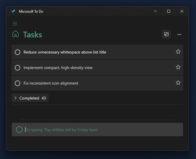
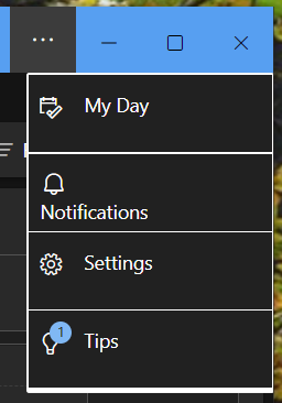
In practice, mobile-first has meant broad-reaching dumbing-down of software. For new versions of legacy software, that means removing features, simplifying functionality, and revising the user interface (often only partially) for touch interaction. Meanwhile, wholly new mobile-first software often fully adopts constraints and compromises that ostensibly make sense on mobile: hamburger menus, absent drop-down menus, absent keyboard shortcuts, absent on-hover effects, support for only the left mouse button, gestures, and so on.
The result is desktop software that grossly mismatches the medium. Mobile-first desktop software commits several UX faux pas, including consuming valuable screen real-estate with exaggerated white space, using oversized UI controls, minimizing preferences and customization, reducing information density, and generally expecting desktop users to behave like mobile users.
Mobile-first ultimately means a mobile UI on mobile and a mobile UI on desktop.
The mobile-first movement is a cohort of the Minimum Viable Product (MVP) movement, the two often tightly coupled. The MVP mindset is not necessarily toxic, as feature restraint is commendable when launching something new. However, many teams turn the MVP mindset into a malignant permanent culture of feature culling. Such enduring feature aversion along with mobile-first thinking doubles the hurt on desktops. Consider that desktop operating systems and software once commonly featured broad UI theming support, whereas today it is exceptional to provide a single dark UI alongside the default bright UI.
Arguably, mobile-first even worsens mobile experiences, as it encourages, or at least excuses, bad habits such as low discoverability (e.g., over-reliance on gestures) and low-contrast visual design (which can be caused or rationalized in part by targeting bright OLED screens).
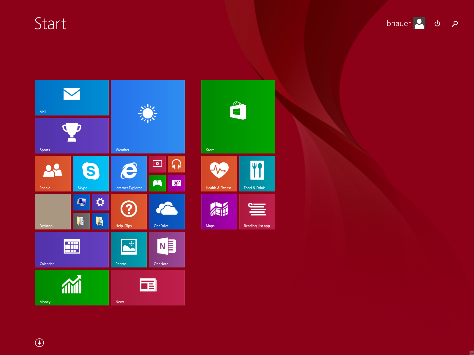
Windows 8, Microsoft's desktop OS from 2012, applied a wide swath of mobile-oriented thinking to desktop computers, resulting in a convoluted mess of gestures, buttons, and hidden activation zones. All of the poor discoverability of mobile UI design made even more frustrating by pairing that with a mouse! If we're going to mismatch UI controls and input devices, we might as build an OS that uses an NES Zapper as the primary input device.

For desktop users, the worst part is this: mobile-first has dominated for so long that a generation of developers have never experienced the breadth and depth of features that desktop software once enjoyed. The situation is not likely to improve.
Over-reliance on automated testing and telemetry
Automated testing and telemetry are useful tools. But over-reliance on these tools can undermine software quality by atrophying the individual skills and organization-wide capabilities of manual testing and user acceptance. Sowing too much reliance on automated tools and telemetry inevitably reaps glaring defects experienced by users.
Telemetry can reveal when a feature is used, but not user intent. For example, if you don't have copy and paste functionality, your telemetry won't tell you that your customers hate the "duplicate-item flow" you've provided instead. In fact, upon seeing repeated runs through the duplicate-item flow in the telemetry data, you might think, "Users love duplicating items using our multi-step process!"
Similarly, telemetry and automated testing would not easily reveal that users are frustrated that you've not provided keyboard shortcuts. Or that the keyboard shortcuts are poorly selected and result in frequent user error. Few development teams collect sufficient telemetry data and/or analyze it sufficiently to surface these types of failures. (And to be frank, collecting telemetry data in sufficient volume to surface user frustration would be egregious from a privacy point of view.)
I suspect everyone has experienced closing a browser tab of an under-performing web site out of frustration. Ironically, many sites are sluggish because they have loaded up too much telemetry and analytics. Telemetry won't tell you that your users hate your software because of the telemetry.
Still, despite the deficiencies, many teams tacitly behave as if an issue not directly reported by the telemetry data either didn't happen or doesn't matter. Because so little manual testing occurs, teams wait until issues are reported by users, triaged by analysts, and ultimately rendered as automated tests before they are resolved.

A concept of "dogfooding," where product teams ensure they use their own product every day, and therefore catch design defects and bugs early, seems to have waned in popularity. This should be clear to anyone who has used the "New Outlook" from Microsoft, which is a drastically revamped and compromised version of their classic email and calendar tool that is "new" for 2023/2024. It is so lacking in feature parity versus the prior version that I can't fathom managers at Microsoft are using it.

Cloud native
More obnoxious marketing term than quantifiable concept, "cloud native" typically refers to products that are designed to play well with today's cloud-centric computing environments. In that way, we can reductively interpret it as simply a signal meaning new. This database platform isn't old, it's cloud native, so you know it's new.
In practice, cloud native often means the product or tool is deeply integrated with cloud services such as those provided by Amazon, Microsoft, or Google. However, as should be expected, examined from another angle, this means cloud native products typical eschew local resources for more expensive options provided by third-parties.
Hence, the risks associated with being overly enamored with cloud nativity are fairly obvious. To name a few: potentially higher costs (sometimes dramatically higher); generous data sharing with third-parties; greater susceptibility to third-party performance, downtime, and business continuity; vendor lock-in.
Cloud native tools and software can contribute to development teams' misunderstanding of scale. Modern developers often lack appreciation for the computational capacity of hardware paired with fast software. Cloud nativity can lead to grotesque mismatches of architectural complexity and problem complexity. Where a problem could have been solved by a single machine running efficient software, a cloud native approach will often result in alarmingly complex architectures that leverage numerous cloud services, which in turn bring astonishing bills from Mr. Bezos.
Perhaps most pernicious is the cloud-native organization, by which I refer to companies or teams that reject direct data ownership, instead relying on a chaotic tangle of third-party services, each with wide mutual functionality and data overlap. Cloud native organizations often subscribe to a dizzying array of services: an issue tracker service, chat platform, white-boarding service, customer service tool, sprint planning service, sticky notes service, note-taking service, calendaring service, email service, office docs service... Potentially dozens of services, each designed with elevated expectations of its own importance and utility at the expense of the others (e.g., the issue tracking service has a calendar it expects you to use with issues). Without enormous effort, a cloud-native organization will experience split brain syndrome, where information and knowledge is haphazardly sharded among myriad third-party cloud-hosted services. Ascertaining the organization's present state or its path forward requires aggregation and de-duplication across these diverse services, an effort so cumbersome that productivity is stunted.
How to improve
Each of these pathologies can be avoided, and often without extreme effort. But doing so requires deliberate care.
When building software that targets both mobile and desktop use, apply sufficient design rigor and thought to the desktop target. Seriously consider a desktop-first approach: a full-featured desktop version and a mobile version that removes functionality and adapts to a smaller touch display as appropriate. Mobile-first makes it too easy to fall into the trap of a mobile app that grows to fill desktop monitors.
Ensure your team is always using your own software and manually exercises use-cases they see as unusual. Talk with your users. Ask them what is missing and what they like or dislike. Recognize that while telemetry will show you a feature is used, it correlates that with no understanding of user sentiment about that feature. Do not enshrine telemetry and automated tools above actual dialog.
Respect your data and don't capriciously share it with every third-party that promises a silver bullet cloud-hosted service. When evaluating services, always consider where it overlaps or conflicts with services you already have, and strongly bias against information and functionality duplication. Use a single task tracker as a source of truth. Understand the computational capacity of simple high-performance software to avoid over-complicated architecture.