You know what I didn't need in my life? Another computer.
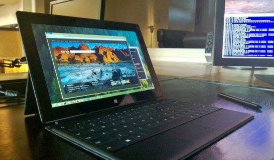
Oh for the love of...
Let me explain
Still, I could not resist a product that takes a tangible step closer to what I would consider an ideal for portable devices.
To recap, my ideal for a portable device is a portal onto the computing power, application state, and the totality of data housed on my home network. What I would call a small form-factor terminal for viewing persistent omnipresent applications (
PAO).
With that in mind, you might think it odd that I would buy a portable device with as much internal computing power as a Surface Pro. Allow me to explain.
Deciding factors
- Small form-factor. With its 10.6 inch display, the Surface is a tablet-sized device.
- Moderately high-density 200 DPI display. 1920x1080. That's the same resolution you might have seen elsewhere at a shameful 27 inches or worse.
- Designed from the start to be paired with a portable keyboard.
- Not a laptop.
- Pen input. In my head, this seemed cool.
- Windows, and I run Windows on my other computers.
- Cheaper than a Tesla Model S, which is arguably a superior portable computing device.
Most importantly, despite my obsession with PAO, that remains a figment of imagination. Harsh reality says that whether I like it or not, each device I own is an island. An island with an international airport, but an island nevertheless.
As such, each device must defend its right to exist on the mean streets of my household by performing computing tasks of my choosing on demand before I lose my patience. A device's tour of duty is uncertain in my house and prone to capricious upheaval, but I would be far more gentle if the devices would just submit to lobotomies and become terminals to a persistent application state. Alas.
As long as every damned device I own is going to be a full-fledged computer, it best be fast if it knows what's good for it.
So Intel Core i5 in a tablet form factor? Yes, please. That's the best you've got, right? Okay, give it here.
ARM, you ain't got nothing on this. Well, 'cept battery life, but shut up about that would you?
Purchase
Microsoft has these retail stores that, if you close your eyes, don't look like Apple stores at all. Much darker.
Michelle and I visited the Century City (Los Angeles) store last weekend to reserve a 128 GB Surface Pro. A reservation afforded me the luxury of carefree lethargy this morning—the morning of release day!—knowing my Surface Pro was chilling in the store-room awaiting my arrival.
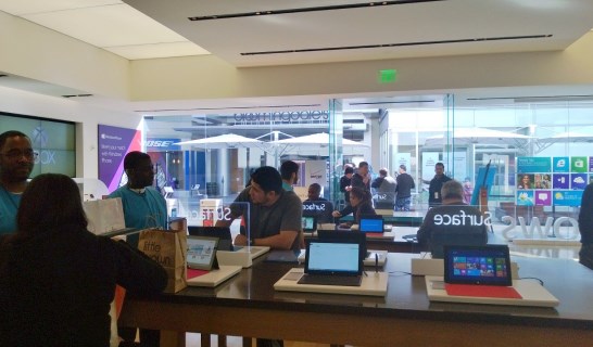
Good thing, too, because the line of five or six guys outside the store when I casually strolled in at noon today clearly had nefarious designs of their own.
Five or six guys! The store could have
sold out!
But no, a Surface Pro was mine. It even had a bag with my name on it.
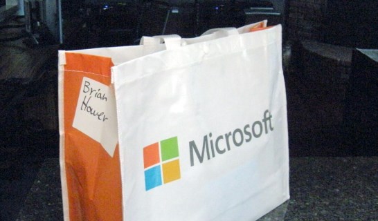
Inside my very own bag, I had selected the following:
- Surface Pro 128 GB. Yes, that's measured in gibibytes, and yes, it's before the operating system and applications. Good grief, people, get an f'n grip.
- Type cover. That's the slightly thicker keyboard that has a tiny bit of key travel. Don't call it a laptop!
- A spare AC adapter, because hey, Microsoft is poor and what better way to donate some money to their righteous cause than by paying for a grossly overpriced accessory?
- A micro SD card for some extra storage capacity. These things boggle my mind. Why can't we see that kind of tireless forward momentum elsewhere?
Unboxing
Time to dig in.
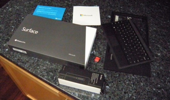
Let's pause the story a moment to take stock of what I have liked up to this point of unboxing:
- The keyboard. It's fantastic for its size and weight.
- The design of the packaging. Hey, you sink over one kilodollar on a slab, er Surface, thing, and you'll want a glamorous package.
- The pain-free purchasing process.
But not all is rosy at the time of unboxing:
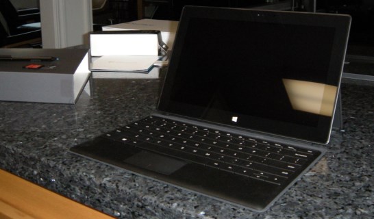
Gah! Glossy screens are the work of some evil deity. This didn't come as a surprise—I knew Surface Pro didn't push the needle to Full-On Pro, the mythological utopia of matte screens. Nevertheless, glossy glass always gives me ocular pain.
Installation
Surface Pro, meet your working-class neighbor, Mrs. Lenovo Netbook. Now, Mr. Surface, you might be the wealthy high-roller in this hood, but like a rich twit who has more money than design sense, you bought the glossy Porsche Panamera. Mrs. Lenovo saved a bundle, buying the matte Kia Optima. Don't let it eat you up too much.
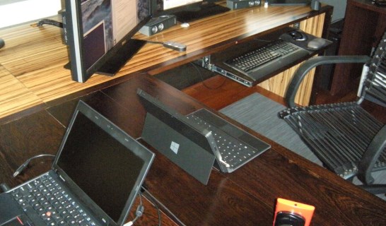
We pause once again to take inventory of more good things:
- The power adapter is one of those fancy-smancy magnetic connectors. Click.
- The kick-stand is quite nice. Plus it has a Windows logo on it. Angled up at people on the other side of the table. I can sit across from someone using a Macbook Air, snap out the kickstand, and say, "More than you can afford, pal. Windows!" (I just hope he doesn't smoke me.)
- Not too heavy. Yeah, it's two pounds, which is more than an iTablet or Droidslab. But did you see the Windows logo and keyboard? Yeah, you did. Burn.
And more bad things:
- Let's be clear here: what I really want is inductive charging like the Nokia Lumia seen at the bottom right of the photo. I want to just drop the Surface down—park it, if you will—and have the charging commence. Preferably initiated with a triumphant beeping melody just like my phone.
- It's a little heavy. The Windows logo alone weighs half a pound.
Power-up
Let's do this.
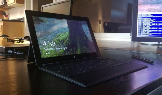
The initial software set-up process for the Surface Pro and Windows 8 was entirely too painless to even warrant much storytelling. I was asked to login to the Windows Empire, and I did so. The Surface then proceeded to download my life according to Microsoft.
Oh goodness, embarrassment sets in as I realize fewer than 128 GB are available on the internal disk. Mortified, I think fast:
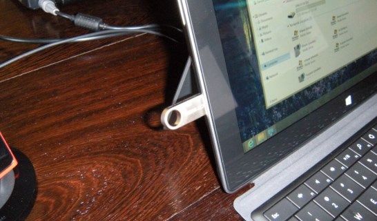
A deep breath and calm returns as I see the free space reach over nine-ty thousand megabytes. Whew! Now I have plenty of room for my many megabytes of datas! So many datas.
Good stuff:
- Holy moly, that screen. Sorry, my camera can't take a photo of the screen to save its sorry life (to the trash bin with you, camera!) You'll need to take my word for it. The screen is ... wow. Where was I? Oh yes, screen. Nice.
- Crikey, it's a quick little sucker. If I had not recently upgraded my desktop to the demi-beastly i7 3770K, I'd be awkwardly using a tablet with more computing power than my workstation. Talk about shame.
- Touch-screen + keyboard = success. It's a combination of business and fun for your fingers. Which is business and which is fun? You decide!
Bad stuff:
- Glossy screen. Oh, did I mention that earlier? Yeah, well, it bothers me. Fingerprints and reflections.
- Okay, I wanted to like the pen, but so far, I'm not sure. Frankly, with the trackpad and touch-screen, you have two ways to control the position and size of windows. Two isn't enough options for you? Then you'll love having a pen as well! Surface 2 should add a foot pedal accessory.
The pen really has me confused. It would be awesome if it did more than it does. I am a little surprised to realize there is no preinstalled software that transcribes handwriting into written notes nor does any Office application do that. (Onenote does have handwriting recognition, but it's not designed for the use-case I described. It does whole-page conversion of handwriting; not as-you-write.)
I had this delusion a month ago that the pen would latch inside the edge of the tablet somehow. But no, it just attaches magnetically to the edge. It's not clumsy, but it's also not wicked sick cool.
On the other hand, with the pen as a pointing device, you can right-click on the desktop. Try to right click with your finger. Just you try it! It can't be done. Even rolling your finger on its side. Nope, not a right-click.
Windows 8
I've already been drinking in Windows 8 on my desktop, so this one didn't have me in convulsions.
Windows 8? It's Windows.
Versus Windows 7, you gain fast boots and lose Aero glass. Fast boots. No glass. I'm not sure how I feel about the trade-off. I would have preferred a squared-off Aero glass.
Oh yeah, there's the start menu formerly known as Metro. I had all but ignored that on my desktop.
It doesn't work very well with this monitor configuration:
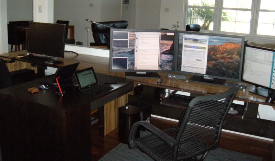
That said, as you've heard elsewhere, Formerly-Metro is at home on a small screen tablet-like device. So let's talk about that.
Metro on Surface Good Things:
- Looks great.
- Slide-in from the edges is a convenient way to get to the options menus.
- The not-quite-alt-tab-but-the-same-idea swipe from the left to, uh, "alt-tab" between running applications is pretty dang slick.
- Despite much hubbub about woe-is-me-not-enough-apps, there are way more apps in the app store than I'll ever have time to peruse, let alone install and try.
- The side-by-side 33/66 horizontal-split view is clever and might be useful in a pinch. (Bonus points if you know what the remaining 1% is used for.)
- The live tiles are cute and moderately useful. I applaud Microsoft for trying something new here. No, it's not making my life bliss, but I greatly prefer this to a grid of static icons.
- Some—not all, but some—of the apps are quite good. I like the CNN app I downloaded. And the Bing Maps app is buttery-smooth, but not in a bad way like smooth jazz.
That sure was a lot of hyphens. Now Metro on Surface Bad Things:
- How the heck do I close a Metro application? Do I even? Am I not really supposed to? Is this a computer or a phone-like thing? This is a Surface Pro; am I a professional or not? Do professionals close applications? Professional! (Turns out I just mash function-alt-F4, which seems to do the trick, if a little clumsily.)
- Moving tiles around on the start menu was shockingly time-consuming. It's like a game of Tetris but not as fun. It reminded me of the days when I played Warcraft and spent precious minutes not chatting or waiting for a battleground queue but moving gear from one slot to another. The nerve! I am busy, I don't have time for this.
- The "Desktop" app is the best app. It's like this windowing environment where you can open and manage other apps to your heart's content. Oh, wait a second...
Readers more savvy with Formerly-Metro-Now-Something-Else have explained that in order to close a Metro application, you can swipe in from the top of the screen downward. The trick is, if you don't swipe enough, the context menu will appear—at the bottom of the screen!—making you feel quite the fool. So don't be a fool like me: to close a Metro app, make a big swipe downward from the top of the screen. Hardware
The Surface Pro is a little thick. It gets a little warm. It's a little heavy. But you know what? The CPU in there kicks a little ass. I give it a pass if it gets a little sweaty doing my evil bidding at such a fast clip.
I've already covered most of the good hardware stuffs, but here are a few more related to the screen:
- The screen is ridiculously bright, but in a good way. Not "oh god the sun is in my hands" but "ahh, I can see the screen very clearly even though the glass surface is nearly a mirror."
- Although as shipped Windows 8 is configured with the user interface zoomed to 150%, you can turn that monkey business off and get down to the nitty-gritty of squinting at unbelievably small type. I love it. I can't wait to fire up some code editing on this thing.
- Mini display port. That means the potential for some serious display firepower.
And here are some of the bad hardware stuffs:
- The kick-stand could use another notch or two. One-size-fits-all is in play here, and surprise, it doesn't really fit all.
- The speakers are anemic. The Surface is not for listening to rock and roll music at McDonalds. Get some headphones if you want to fire up EDM and get funky at your desk.
- It takes a split second to wake up from idle. Not sure why. This is the kind of thing that will eventually give me a nervous twitch. I'll be pressing every button. Wake up! Ahhhh! Must. Keep. Calm.
- Intel HD Graphics 4000. Haha. Intel. Graphics. Hahaha! That's choice.
Surface Pro-tip
If you buy a Surface Pro at the Century City Microsoft Store, don't miss this important accessory:

Available at the bakery across from the upcoming Tesla store. You could also pick up a Model S while you're there.
 Oh for the love of...
 Good thing, too, because the line of five or six guys outside the store when I casually strolled in at noon today clearly had nefarious designs of their own.Five or six guys! The store could have sold out!But no, a Surface Pro was mine. It even had a bag with my name on it.
 Inside my very own bag, I had selected the following:
 Let's pause the story a moment to take stock of what I have liked up to this point of unboxing:
 Gah! Glossy screens are the work of some evil deity. This didn't come as a surprise—I knew Surface Pro didn't push the needle to Full-On Pro, the mythological utopia of matte screens. Nevertheless, glossy glass always gives me ocular pain.
 We pause once again to take inventory of more good things:
 The initial software set-up process for the Surface Pro and Windows 8 was entirely too painless to even warrant much storytelling. I was asked to login to the Windows Empire, and I did so. The Surface then proceeded to download my life according to Microsoft.Oh goodness, embarrassment sets in as I realize fewer than 128 GB are available on the internal disk. Mortified, I think fast:
 A deep breath and calm returns as I see the free space reach over nine-ty thousand megabytes. Whew! Now I have plenty of room for my many megabytes of datas! So many datas.Good stuff:
 That said, as you've heard elsewhere, Formerly-Metro is at home on a small screen tablet-like device. So let's talk about that.Metro on Surface Good Things:
 Available at the bakery across from the upcoming Tesla store. You could also pick up a Model S while you're there.